 Post by Stacey Walker. Stacey mostly works behind the scenes for Greenbrook Design, managing day to day operations, marketing, sourcing product and keeping the showroom beautifully designed. Stacey also does interior design & home styling for a select number of clients. Find out more about Stacey here.
Unconventional colors in kitchen that we love
Are you thinking of remodeling your kitchen, but you’re tired of neutral colors? The same stained wood seen over and over, or the same white and gray look. While many color combinations are beautiful, if you’re looking for some unique color combos, you can browse here first. We’ve put together some unique color combinations for you to review before you decide on using an “unconventional” kitchen color.
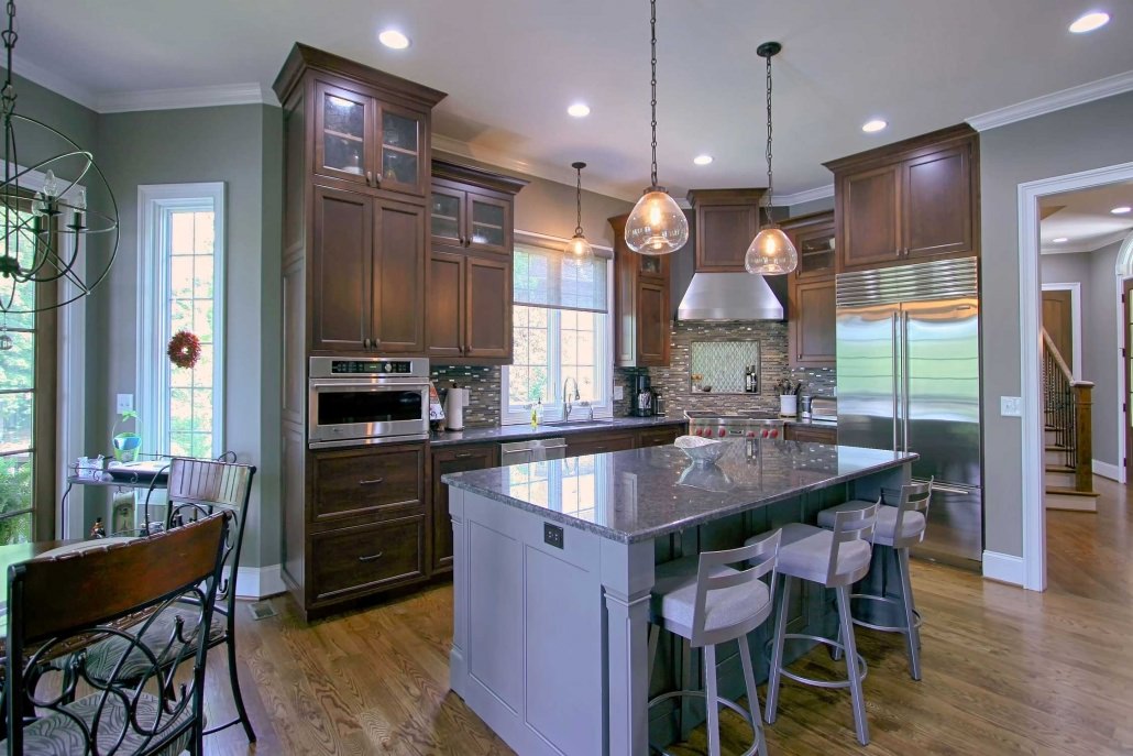
This home features a beautifully stained kitchen perimeter paired with a gray/blue/green-hued island. The color used here was Rialto with a thin chocolate brown glaze. This soft colors in kitchen is unusual and can be paired with a wide variety of other painted or stained finishes. Since it has a variety of different undertones, those colors can be drawn out depending on what the base color is paired with; countertops, tile, flooring, and hardware all played a part in drawing out the cozy hues seen here.
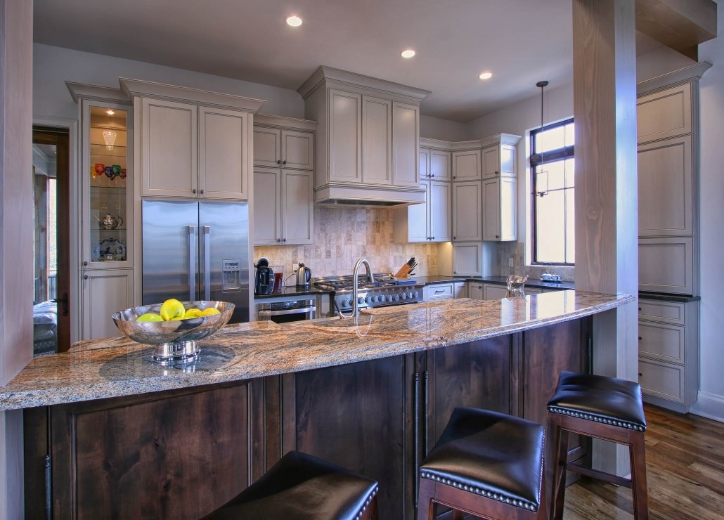
This transitional mountain kitchen showcases a painted perimeter in a non-traditional color, yet the color is still neutral enough to blend with the darker stained island. The paint color that was used here is Feather Gray with a thin silver glaze. We also incorporated a dry brushing technique over the base color, which adds some depth into the door and drawer front molding. This taupe hue is becoming one of our popular colors since it can be paired with other natural tones, or even a stand out louder tone if needed.
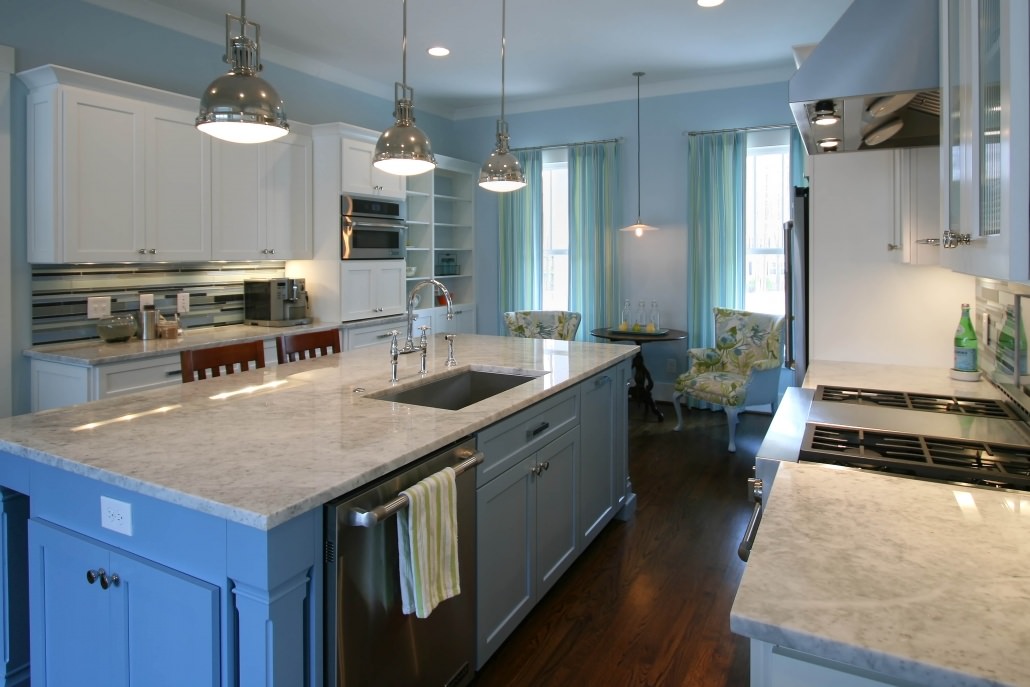
There is nothing shy or shrinking about this bold blue island color. The client and designer that we partnered with for this job selected a Benjamin Moore paint color, Colonial Blue 1677, which we matched in-house using their formula. The other soft blues they used in the space, coupled with the other neutral finishes selected, leave you feeling anything but blue in this fun and functional kitchen. The colors in kitchen, especially the island, make a statement but don’t feel out of place in this down-home Carolina kitchen.
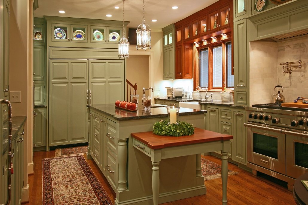
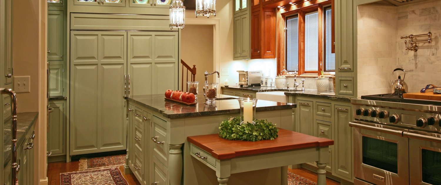
This stately and traditional home in south Charlotte has many of the design elements you’d expect in this type of kitchen. They incorporated raised paneled doors/drawer fronts, integrated appliance panels, inset cabinetry, seeded glass, and ornate moldings. However, the most unexpected detail they chose is the unique paint color seen here. The clients and designer chose to use Chapell Green (from Farrow and Ball colors) with a dull top coat, paired with one of our signature stained finishes using a Cinnamon stain on Select Cherry. Neutral colors were selected for the tile backsplash and the countertop, allowing the cabinets to be the main focus of the room. The beautiful green selected and warm cherry tones used to compliment each other in a distinctive way, setting this kitchen apart.
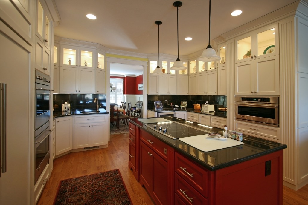
If you are “seeing red” here, it isn’t your imagination. These clients selected this fiery Red Velvet color to anchor their kitchen, by using it on their central island. The color is also repeated in the adjacent room, on the walls of the dining area. The streamlined simplicity of this transitional kitchen lets the colors speak for themselves. Functionality was a crucial detail for this couple, so not only is this island loud to look at, it also packs a punch from the inside out. Spice pullouts on either side of the cooktop come in handy for the chef and utensil dividers in the drawers streamline the mixing and baking prep that takes place on the island.
We have also used other fun colors on standout pieces in many bathrooms and laundry rooms. You can see an array of projects on our website where we use colors in kitchen to make a statement in the heart of the home. All of our cabinetry at WW is unique, but another detail that sets us apart from other manufacturers is our ability to custom mix all of our paints and stains in-house. See an example of how a choice of blue made a statement in this historic farmhouse rehabilitation. During your design meeting, you can select from our ML Campbell color fan deck which contains over 1050 colors. We also have the capability to obtain color formulas from major brands such as Benjamin Moore or Farrow and Ball. HGTV also has a few tips on how to add a splash of color to your kitchen.
Should you have any questions about projects you view on our website, we will be glad to discuss any job specifics with you and answer all of your questions, during your design consultation.
This was just a sampling of our colors and styles, so remember to view our photo gallery for more color ideas, or if you’d like to see samples in person you can call our showroom and set up an appointment time~ 980.404.9600. You can also visit our design services page to learn about how our process works.
Greenbrook Design, a kitchen and bath home center, is only 25 minutes from the Tryon Equestrian Center, so if you are visiting be sure to come by and see us. We are located in Uptown Shelby which offers shopping, food, and entertainment nestled against the backdrop of a charming small town, it is truly a unique and friendly place to visit. We are also only an hour away from Hickory, Charlotte, Asheville, and Greenville, SC, which enables us to serve multiple communities. We would love to personally give you a tour of our showroom, so feel free to stop by anytime, we will not disappoint!
Leave a comment, let us know what you think!
Visit Us in Historic Shelby
112 N. Lafayette St., Shelby, NC
980-404-9600
Dealer for
Walker Woodworking
Showroom
Call & schedule a showroom tour!
980-404-9600


Share this entry